Visual Expression 2
Text and Magazines
Using the half title, title, colophon and chapter one, you are to interpret the text typographically –
you can be as ambitious as you wish, but you should present two different versions of the text.
Version one:
you should adhere to the conventions of typography and the nature of the book in terms of size, format and grid.
Version two:
this is a little more ambitious… The Book and The Magazine share a common
ancestor, however, the book has not moved on much in terms of the object, typography, form
and so on since the days of Gutenberg. Magazines are a different story – from their beginnings
as books with soft covers and a selection of stories rather than one single narrative, they
have constantly reinvented themselves with regards their signature typographic styling, their
combination and integration of image and text, their focus on niche markets and their sense of
adventure and creative expansion
Next we have the Book Jackets.
Development work
Book jacket
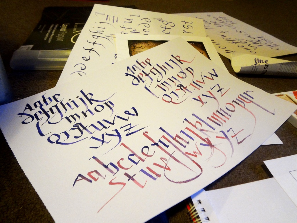
one should embrace the idea of a non-digital outcome, consider making
and photographing both type and image. (the blurb on the back cover can be produced
digitally, however please remember the type rules!)
After another feedback session I decided to try a different approach.
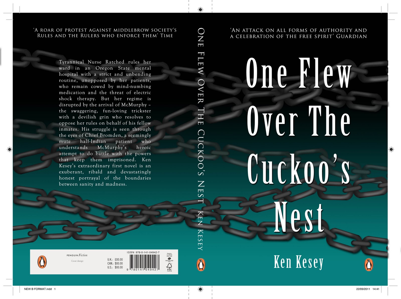
Final Book Cover
Book jacket two
this can be a digital response, however NO VECTOR GRAPHICS ALLOWED.
Final Book Cover
Basically the book covers were designed according to the context of the book..it's a dark mysteries book about a mental hospital and a new guy who comes in and stirs problems with the Nurse who's incharge of the whole ward. It's a really good book and film..:)