Tuesday, October 22, 2013

Magazine Layouts Reviews

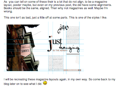
I normally do not update this blog anymore, but i thought i really needed to share this. I felt so blessed when an editor emailed me and invited me to submit my magazine layouts for a graphic design book she was compiling. Curiosity got the better of me as to how she found me and i did some research. And to my amazement, I found alot more people blogging and reposting it on Pinterest and other sites..I just wanted to thank you guys for the kind words and encouragement. #feelingsoblessed.

Ps: i've attached screenshots of some of the websites I managed to come across..:)

--------------

--------------


--------------
(Captured from Pinterest)


--------------

--------------


--------------


--------------


Sunday, October 21, 2012

Moving on to bigger things

Hello everyone..just a quick redirect..I have started another website to start showcasing my work..I have moved on from blogger (it has done me wonders)..I decided to go for a cleaner and more sophisticated look..sp please go to 
to have a gander..

Thank you

Monday, May 21, 2012

Data Visualization


The data that I have chosen for my personal graph, is time spent during the Easter break. The time span is 4 weeks in total, and it is distributed between Mondays to Sunday. It is a “part to whole” graph that has a total of 24 hours. I found this format to be most appropriate because it allows me to compare all hours on activities within the span of 24 hours. It is clear, precise and straight to the point. The reason it is placed as such is simply because I wanted to make the graph more appealing rather than just relying on the colour scheme.

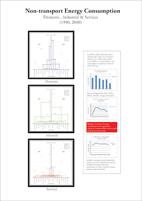
The second graph is about non-transport energy consumption, divided into three parts, domestic, industrial and services. For this graph, I decided to make a comparison with the information from two different years, hence putting them both side by side. I decided to use a line graph because I felt it was the most effective and not overwhelming congesting.  I also provided more data by doing a comparison of the total amount of energy consumption for 1990, 2000, 2006 until 2009. The other comparison I did was show the biggest hike for domestic energy consumption. The last graph is based on the other non-transport energy consumption. It states that the data includes construction and unclassified energy use in the industrial column.  I found this interesting hence the comparison graph.


Conflict brief

Conflict Brief


I decided on Social class as my conflict for this brief. It is mainly to do with how society is seen these days compared to the 14 century. Modern Britain is still a class society. Although traditional markers such as occupation and income are no longer reliable categories for differentiating between classes, cultural and social codes still maintain traditional hierarchies of former eras. Anyone who has ever watched Little Britain, Harry Enfield or Shameless can see that popular culture maintains standardised class portrayals.
The point I am trying to make with the video and printed media, is that class can also be based on materialistic thinking. We judge people and try to categorize them in a class we think they belong in, just by looking at them. What clothes they wear, what car they drive or how much money they have. It is a stereotypical way of thinking but unfortunately we all do it.
I got the inspiration for this video from my lecturer and also from the “Class Sketch” featuring John Cleese and two Ronnies. They talk about three different classes, using the tallest person as the upper class man and the shortest man as the lower class man. 

(Original Video)


But in my video I used the same man, with the same height to show equality. He is dressed differently thou to show their stand in society. And all three remain speechless to show thought.

My Video


In the end it all boils down to each individual, whether or not the class system is fairly decided. We work hard to earn the status that could be destroyed in less than a second, if not carefully watched. 

Printed Media


Saturday, March 31, 2012

The Waitress by Jack Zipes

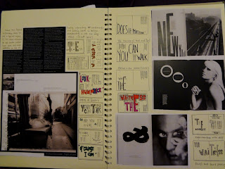
The Next Project we got for Visual Expression was to convert a book into a magazine..We were given "The Waitress" by Jack Zipes. You can find the story here.
and so the development begins..:)

Development Process


Making of the Cover


Got abit distracted with shinny paper..hehe


 a few inside pages


Beauty Shots


Graphic Design 2 - i Newspaper

For Graphic Design 2 we got another brief

 YCN

The i Newspaper

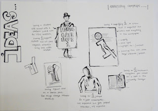
It's was another re-brand brief on a newspaper. We were meant to create a campaign to make this newspaper huge. It was coming up with something new and innovative that was the challenge..but this is my take on it..:)

Development Process 


after much development work , I came up with a slogan "Magnify the i"
It can be interpreted in many ways , but the obvious route of it is to not just flip thru it , but magnify it to find out interesting facts that u'd normal just flip thru.


Final Outcome

 Posters


Billboard & Bustop Ads


 A Student Pack that's to come with a membership
(Bookmarks)


Full Pack