The data that I have chosen for my personal graph, is time spent during the Easter break. The time span is 4 weeks in total, and it is distributed between Mondays to Sunday. It is a “part to whole” graph that has a total of 24 hours. I found this format to be most appropriate because it allows me to compare all hours on activities within the span of 24 hours. It is clear, precise and straight to the point. The reason it is placed as such is simply because I wanted to make the graph more appealing rather than just relying on the colour scheme.
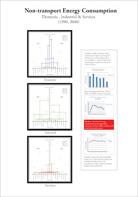
The second graph is about non-transport energy consumption, divided into three parts, domestic, industrial and services. For this graph, I decided to make a comparison with the information from two different years, hence putting them both side by side. I decided to use a line graph because I felt it was the most effective and not overwhelming congesting. I also provided more data by doing a comparison of the total amount of energy consumption for 1990, 2000, 2006 until 2009. The other comparison I did was show the biggest hike for domestic energy consumption. The last graph is based on the other non-transport energy consumption. It states that the data includes construction and unclassified energy use in the industrial column. I found this interesting hence the comparison graph.


